|
If you find this helpful, please click the Google |


HTML for iOS (iPod / iPad / iPhone) Web Apps
Using <meta name="viewport"/> to Control Zoom in Mobile Browsers
The <meta name="viewport"/> meta tag can be used to control how HTML content will be displayed on a mobile device. It contains a comma-separated list of properties in the form name=value as in:
name=value, name=value, ...
The "value"s are not enclosed in quotation marks.
<meta name="viewport"/> Properties
- width
width=device-widthorwidth=nnnwhere nnn is the number of pixels between 200 and 10000 such as inwidth=980(default)- height
height=device-heightorheight=nnnwhere nnn is the number of pixels between 223 and 10000- minimum-scale
minimum-scale=f.ffwhere f.ff is a floating point number between 0.0 and 10.0 such as inminimum-scale=0.25(default)- maximum-scale
maximum-scale=f.ffwhere f.ff is a floating point number between 0.0 and 10.0 such as inmaximum-scale=1.6(defaut)- initial-scale
initial-scale=f.ffwhere f.ff is a floating point number between minimum-scale and maximum-scale- user-scalable
user-scalable=yes(default) to allow the user to zoom in or zoom out on the web page oruser-scalable=noto prevent the user from zooming in or zooming out
Note that when a size is specified in pixels, it is not necessarily the number of actual pixels on the device, which can vary from one device to another. It is the number reference pixels, which is defined in CSS as the visual angle of one pixel on a device with a pixel density of 96dpi and a distance from the reader of an arm's length.
This allows a web site to be displayed the same on devices with different screen sizes and pixel density.
See Using <meta name="viewport"/> to Control Zoom in Mobile Browsers for some examples.
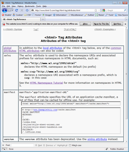
<html manifest> attribute
The manifest attribute on the <html> tag specifies a URI reference that resolves to the URL of an application cache manifest, which is a list of files that can be cached for offline use.
For example:
index.html<html xmlns="http://www.w3.org/1999/xhtml" manifest="/cache.manifest">cache.manifest
# http://www.ExampleOnly.com/cache.manifest
CACHE MANIFEST
NETWORK:
*
CACHE:
/index.html
/styles/style-sheet-screen.css
/styles/style-sheet-handheld.css
FALLBACK:
/ /offline.html
The browser may prompt the user for permission to store the offline content, such as in Firefox:

Apple Touch WebClip Icon
An Apple Touch WebClip Icon is a 57-pixel by 57-pixel PNG image used when bookmarking a web site or web page on an iPhone, iPad or iPod Touch device. The icon image file to be used is loaded from the web server and is specified in a <link rel="apple-touch-webclip-icon"/> tag:
<link rel="apple-touch-icon" type="image/png" href="/apple-touch-icon.png"/>
Other Meta Tags for Mobile Web Apps
- apple-touch-startup-image
- The
apple-touch-startup-imagemeta tag specifies a startup image, which is an image that is displayed while an offline web application is being launched on the mobile device. For the iPhone and iPod Touch, the image must be in portrait orientation 320 pixels wide by 460 pixels high.
<link rel="apple-touch-startup-image" type="image/png" href="/apple-touch-startup-image.png"/>